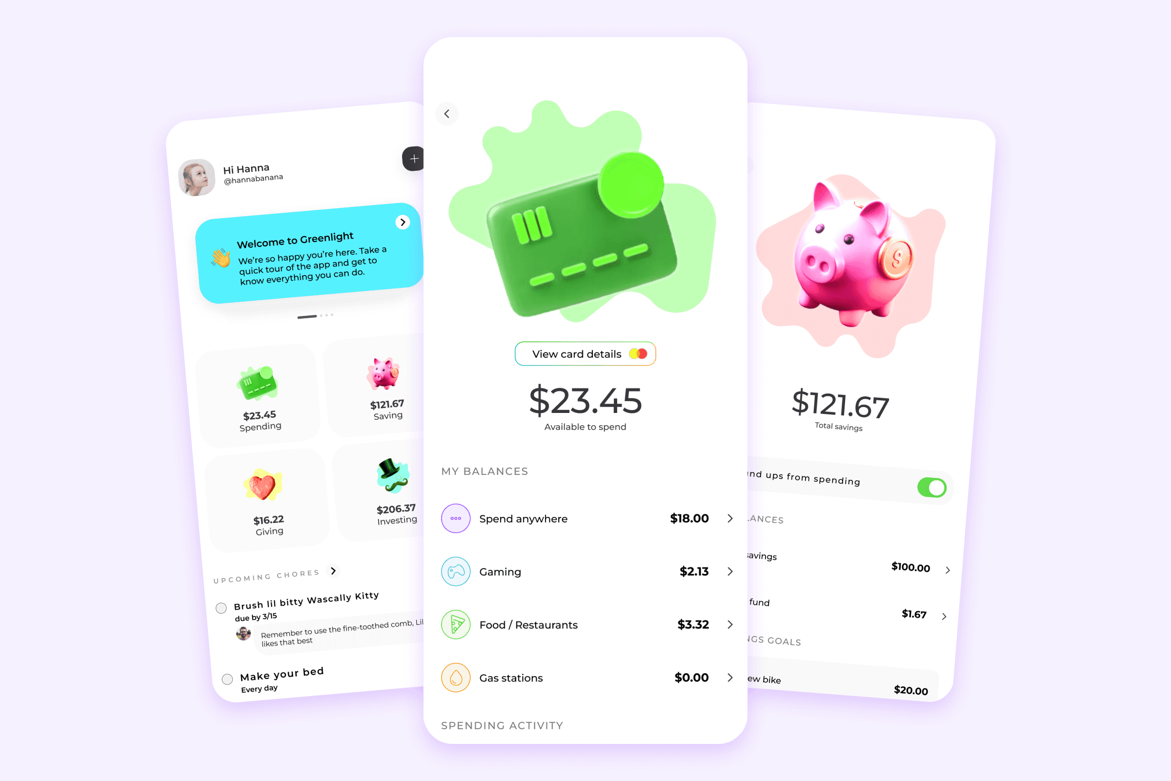
PROJECT
Greenlight
ROLE
Design lead
YEAR
2020
The opportunity
While performing an audit of the Greenlight app, I noticed a lot of discrepancies across similar screens. After talking with the engineering team it became clear that we had a ton of technical debt, and no concept of cohesion across feature sets.
We started simple. How can we componentize our current experience. This started with simple page templates, and conforming to content blocks and containers. I also wanted to ensure we followed basic human interface guidelines, and offered familiarity to our ecosystem.
Diving deeper
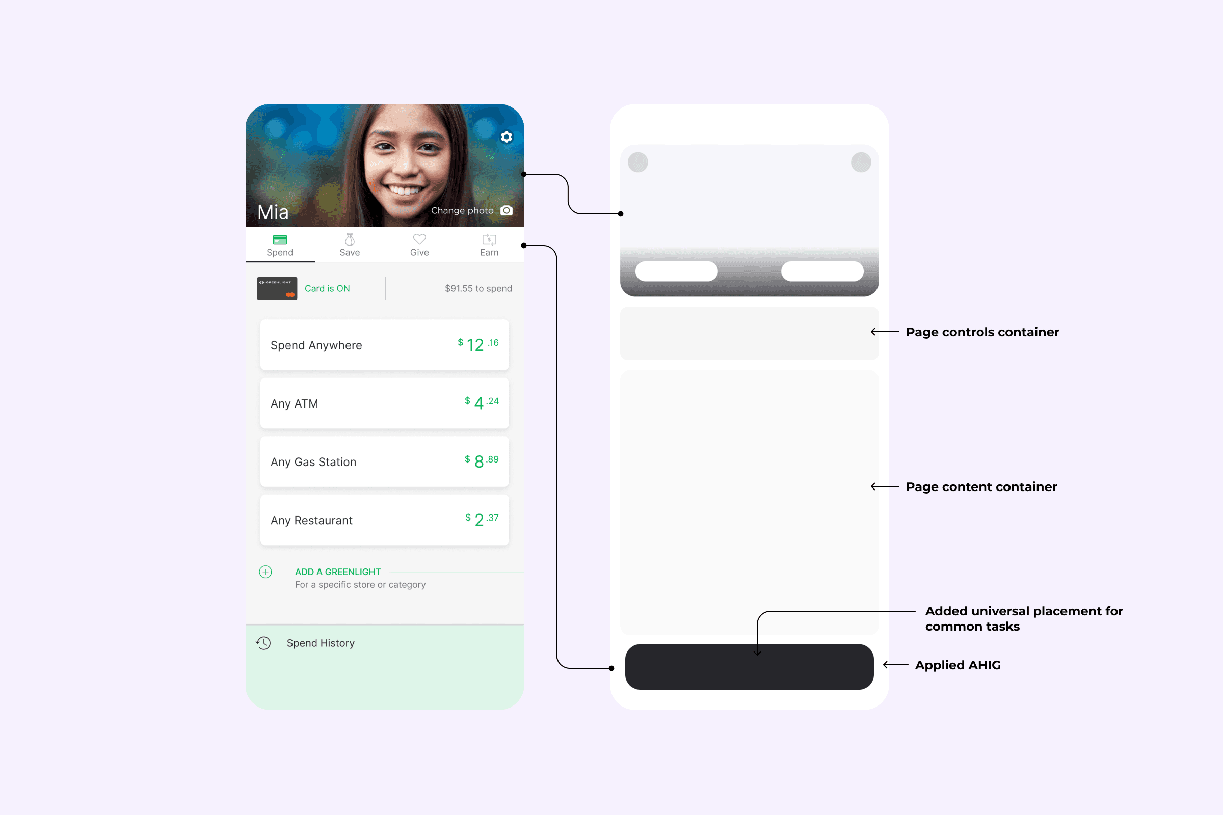
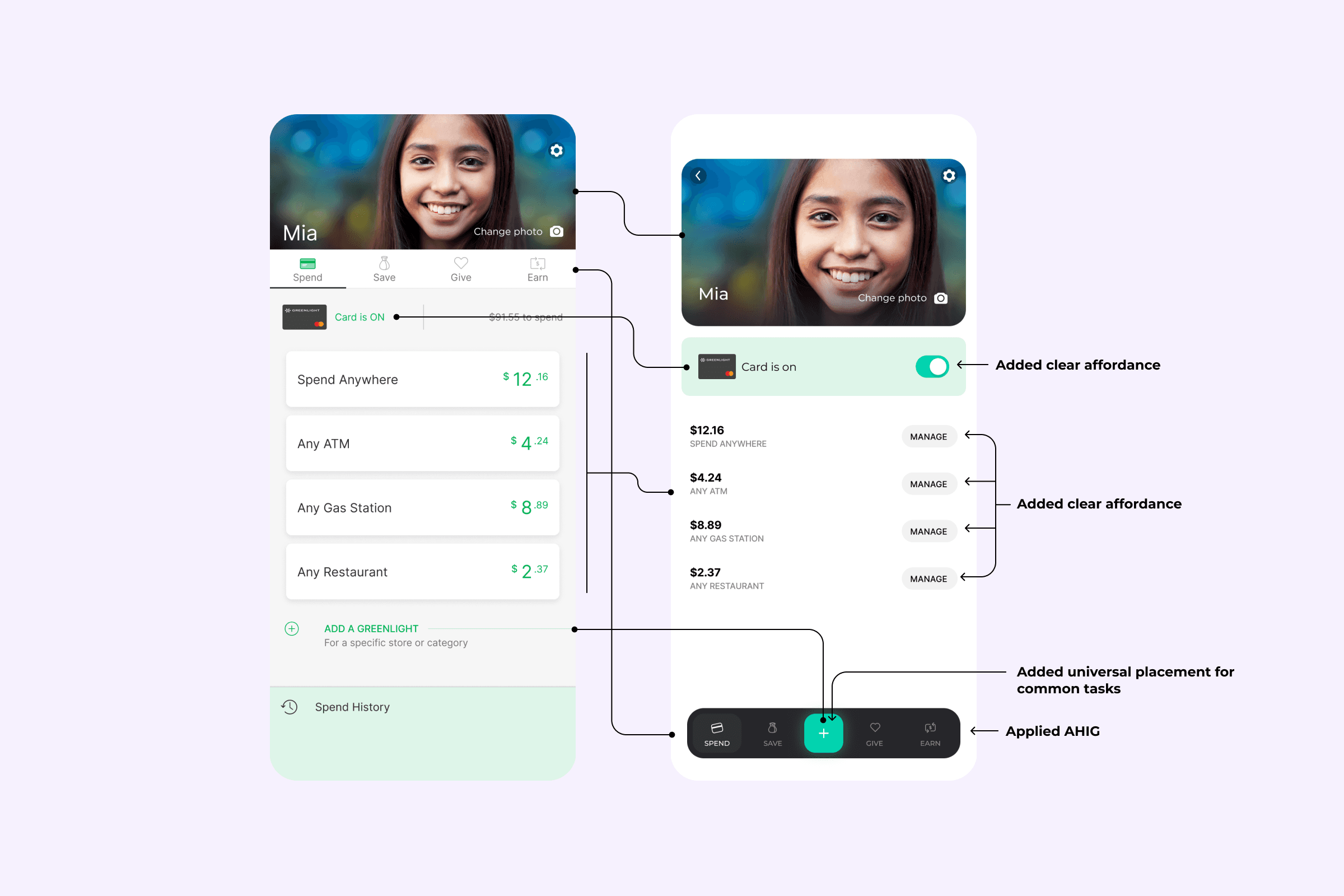
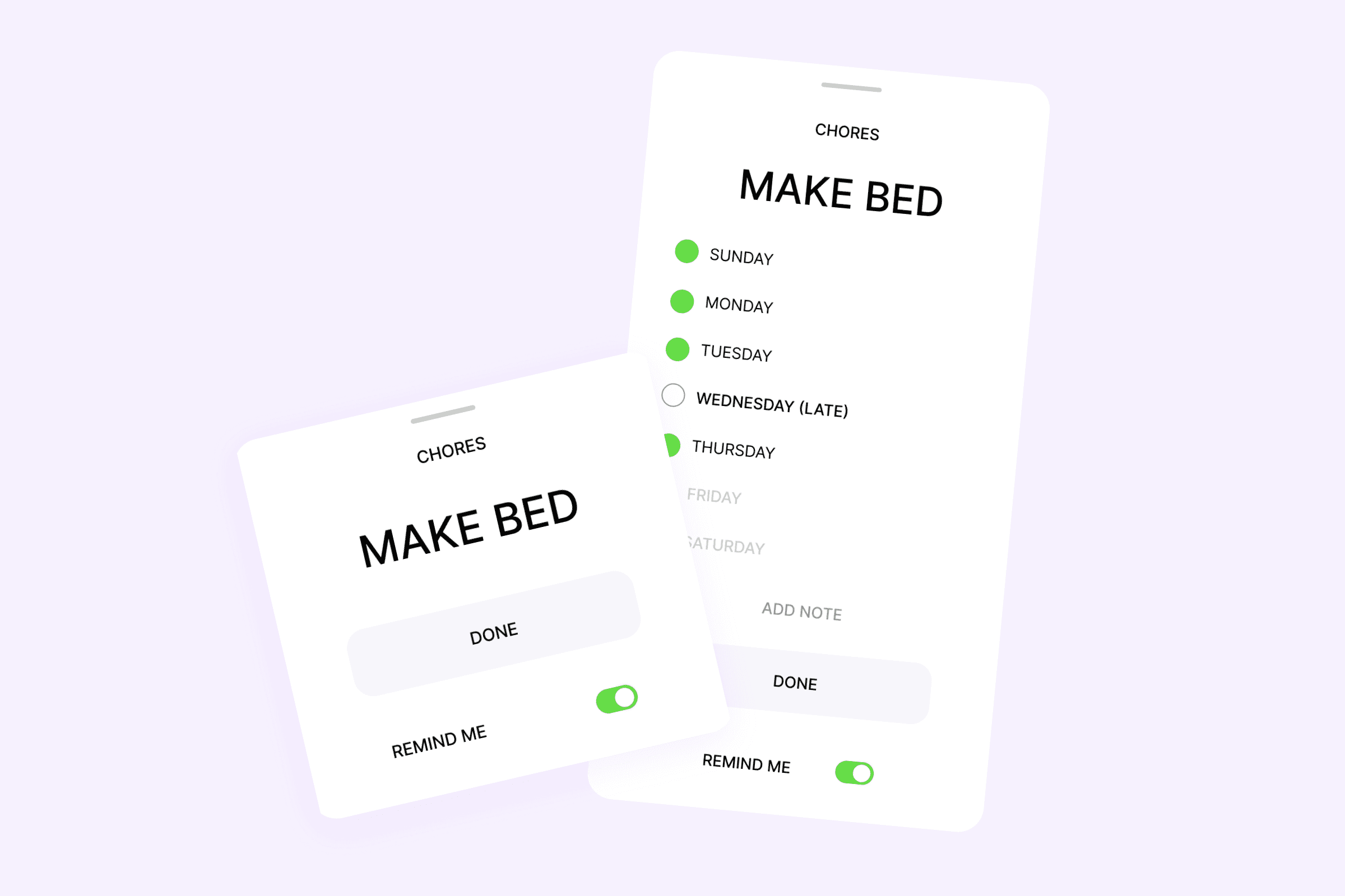
The first step was to address some common known issues: Tappable areas that were lacking any form of affordance, migrating from a web style tab navigation to a more mobile native tabbar, adding a common action element to the navigation.
It was a start, but after reviewing with the engineering team it started to make more sense to not just go for parity, but to reorg the entire app. Since nearly every page would be touched, why not spend that time on a more scalable initiative.
So I went to work crafting the next-gen north-star vision.
The exploration
While working with the engineering team to review some of these changes, I also met with the data team to review user behavior and what opportunities they thought were available.
With these insights in hand I put on my product manager hat and developed a plan to get us to platform stability before some other major features came along.
Here were the core KPI’s I wanted to address:
1. Increase performance & continuity
2. Increase feature discoverability
3. Establish scalability
4. Testability
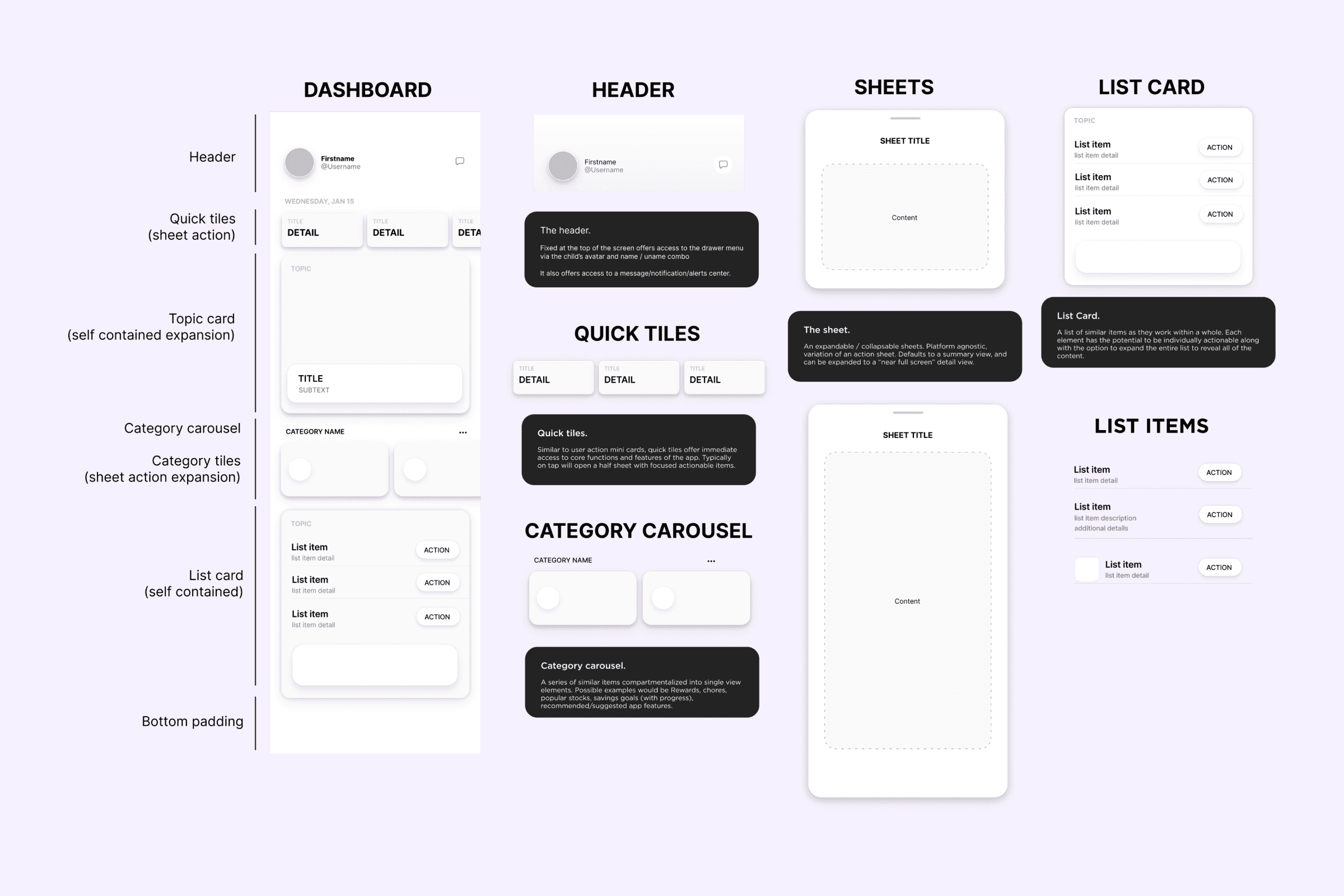
A new direction
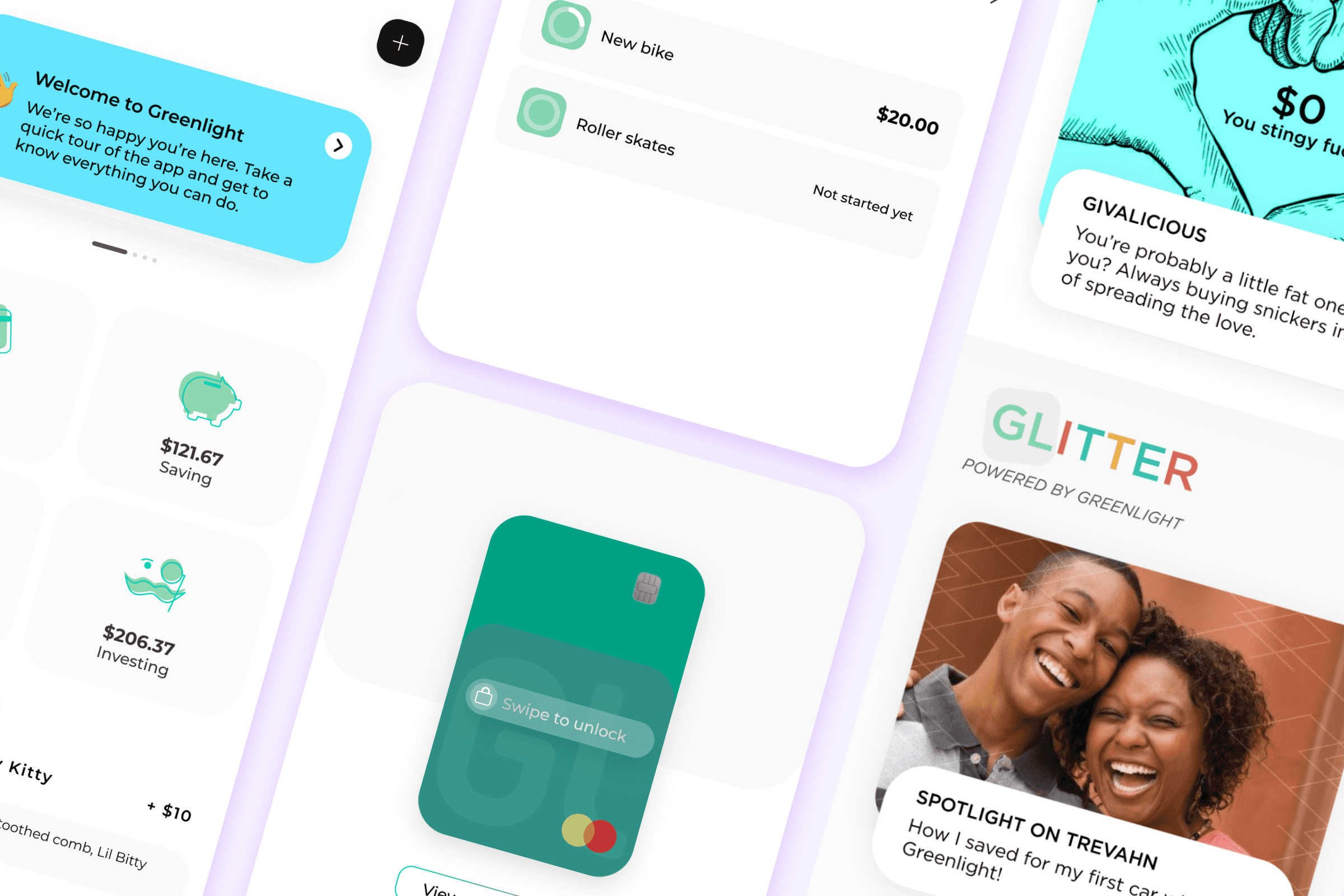
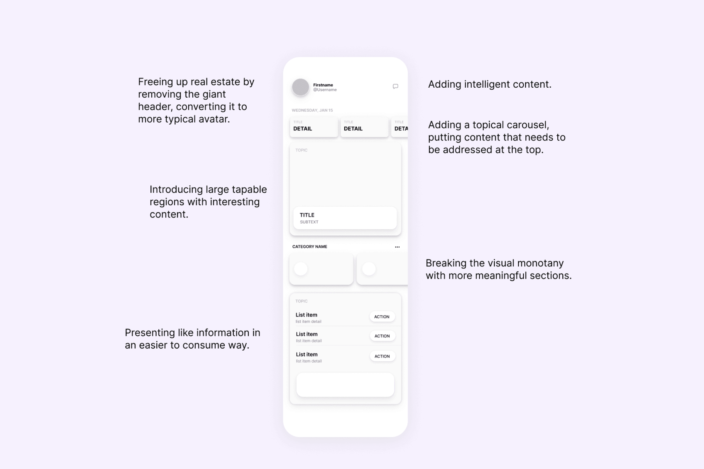
Building off of the behavioral data we had, I also came up with a strategy to bring more attention to some of the features that should have been high performers but were lagging.
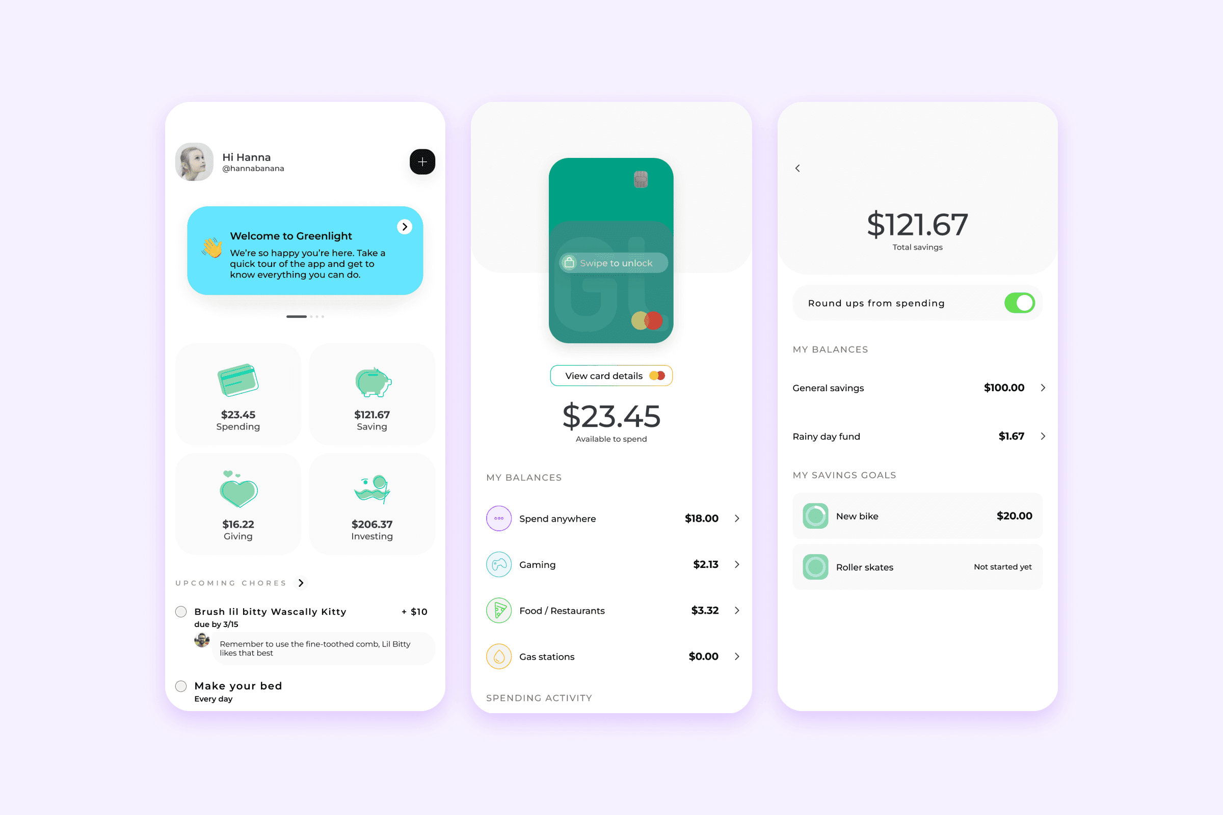
As seen above, just some foundational UI replacements took us to something familiar and easier to consume. However I knew we had a core flagship feature coming and I wanted to make sure there was room to showcase all of our mission aligned features.
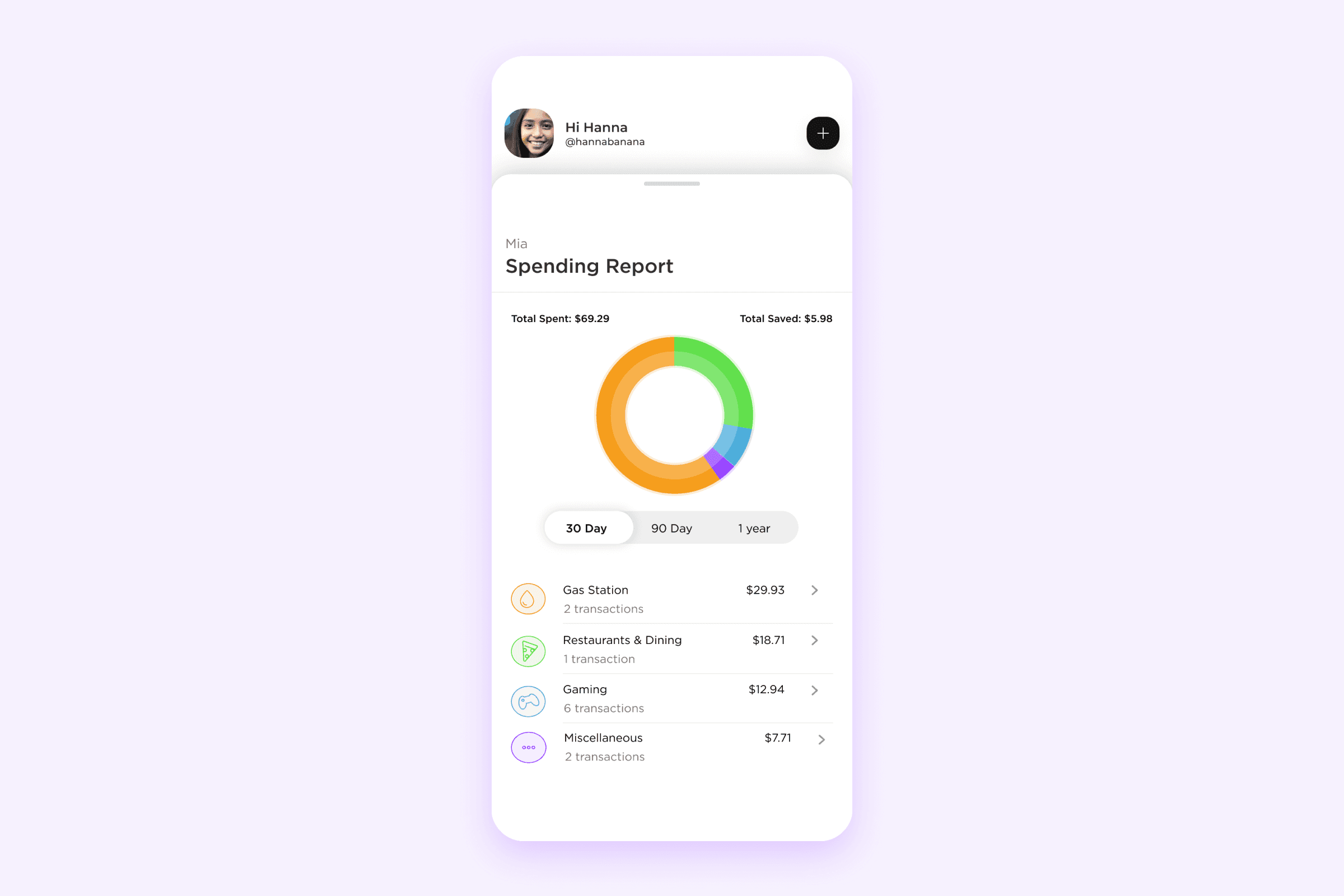
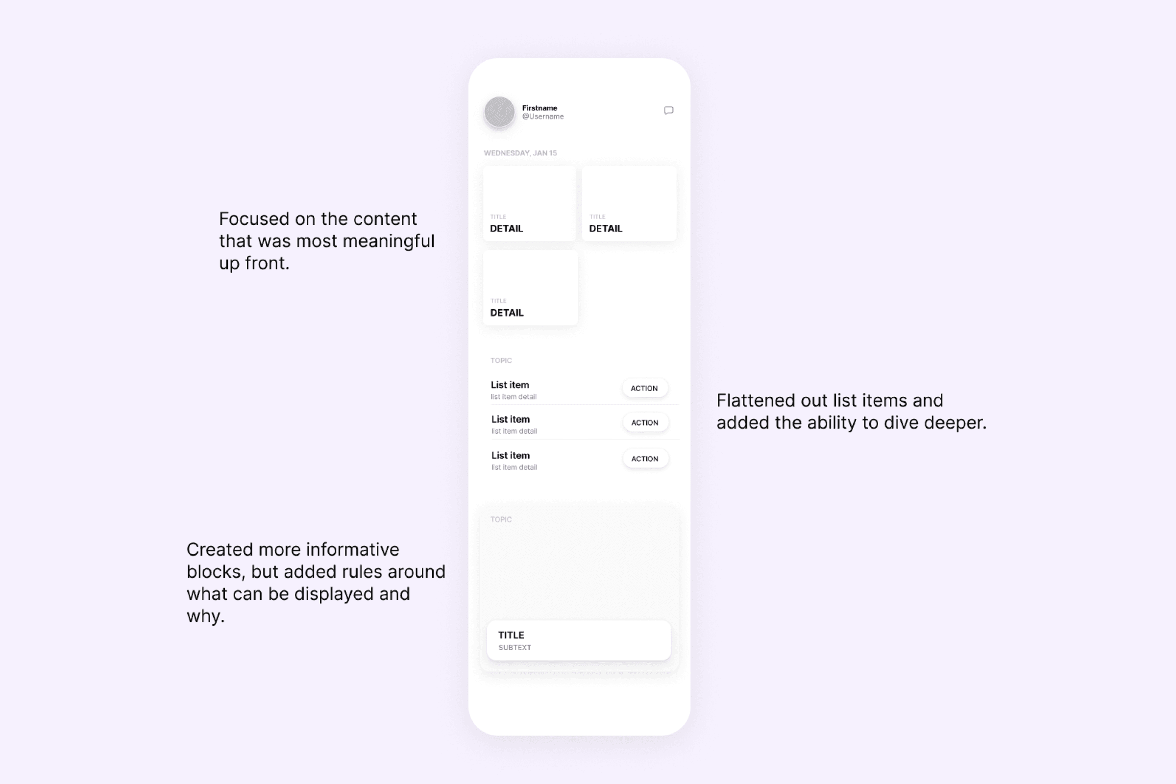
This led to a jump screen dashboard. Everything visible and easily consumable.

Final thoughts
It’s been over 5 years since it was launched and for the most part the experience is still in tact and has weathered a litany of new features and gone through rotating design teams.
This was an exercise of love, not just for our users but for our team, and even though I claim to have led this process it was a team effort.
The engineers weren’t just developing, but finally had a say in what they were building.
The product team was able to feel like every part of the app was elevated.
The marketing team was given real estate and not just relegated to email messaging.
It was a win win win.